Overview
Albertsons provides a Premium Delivery (Renamed as In-Home during the redesign) service, which allows the order to be delivered directly inside the customer’s home or requested location by a highly-rated and trained driver.
The current design is a slot-based service, which is restricted to a 2-hour delivery window only. Consequently, this restricts customers' demand to try this service.
My Responsibilities
I led the end-to-end redesign of the In-Home Delivery feature in the Safeway app from the initial problem statement to the final deliverable. Within two rounds of iteration, I turned the original slot-based premium delivery service into an emotionally fulfilling add-on service available to all delivery slots.
Role
Lead Product Designer
Company
Albertsons (Safeway)
Launch Status
Targeting Feb 2025
Successful Metrics
- Customer Satisfaction (NPS)
- Penetration Rate
- Average Order Value
- Orders Amount
Team
- Fulfillment team (VP, Design Director, PM, Developers, Illustrator, UX Researcher)
- Design System team (Design system alignment)
- Shopper team (VP for approval)
- Accessibility team (ADA-approve)
- Copywriter (Copy-approve)
problem & solution
Current Design
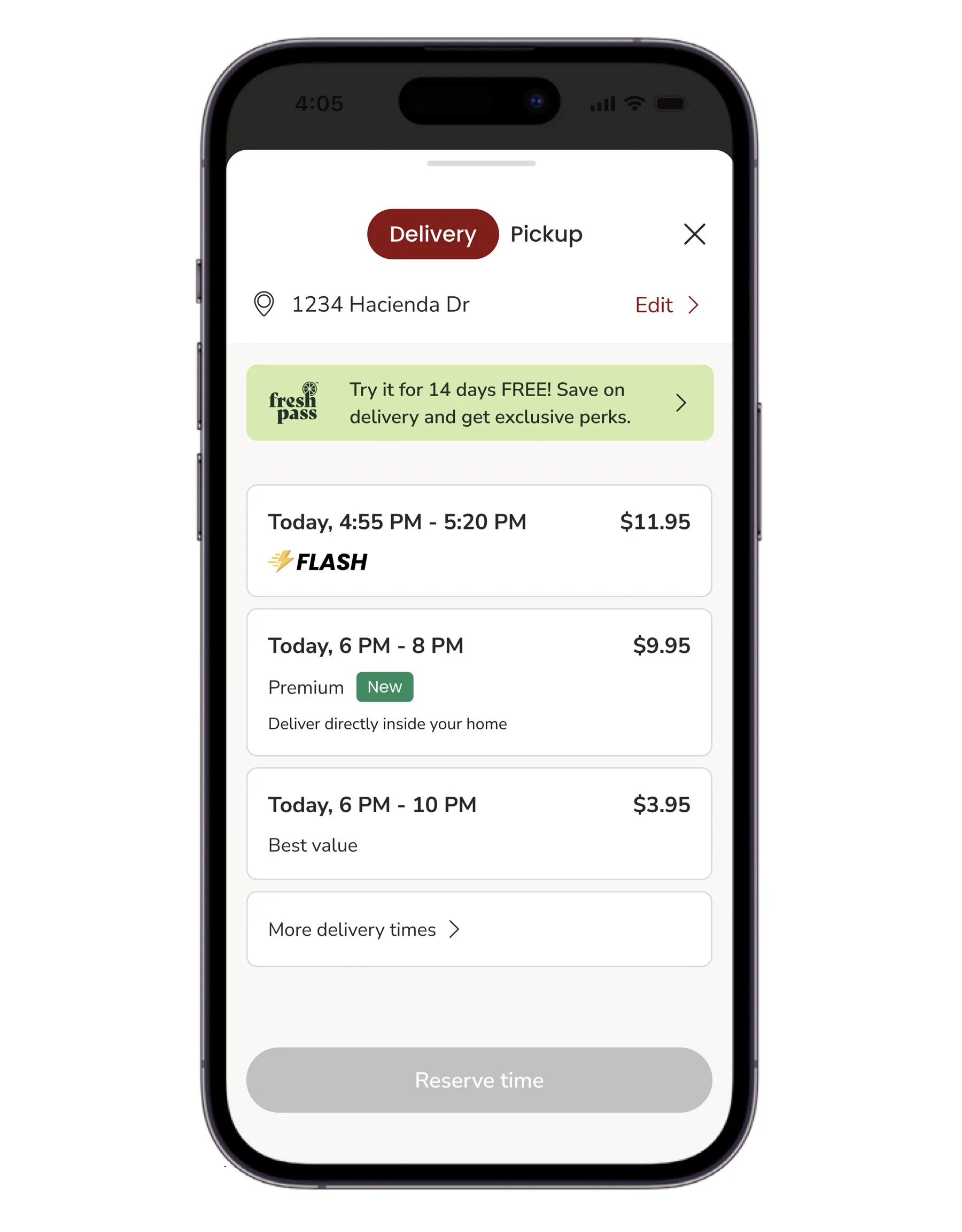
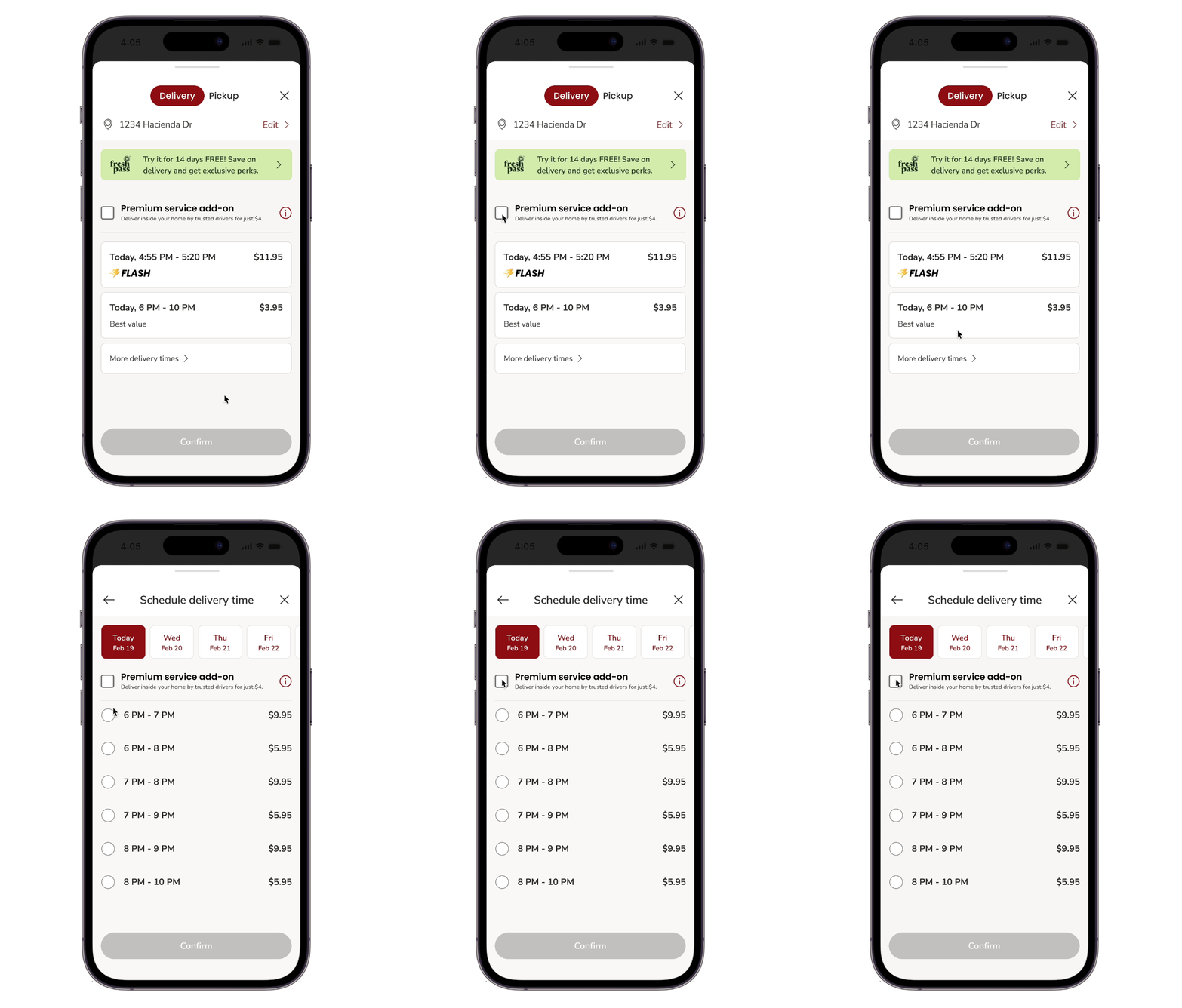
The original design of Premium (Renamed as In-Home) Delivery is a slot-based service, which is a specific type of lot restricted to a 2-hour delivery window only. Consequently, this restricts customers' demand to try this service with other delivery slots, such as Flash slot, most cost-effective slot.
Final Design
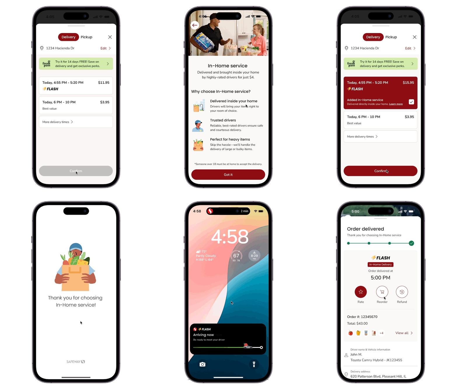
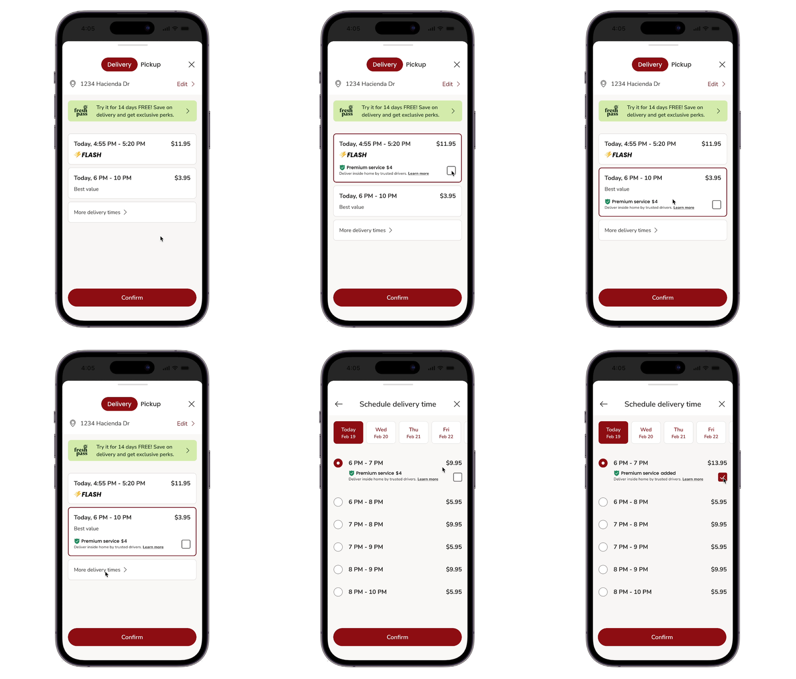
The redesigned In-Home delivery service is an add-on service that is available to all delivery types and slots. It is visually premium, progressively disclosed, branding-focus, and emotionally fulfilling.
Final Design breakdown
Add In-Home service
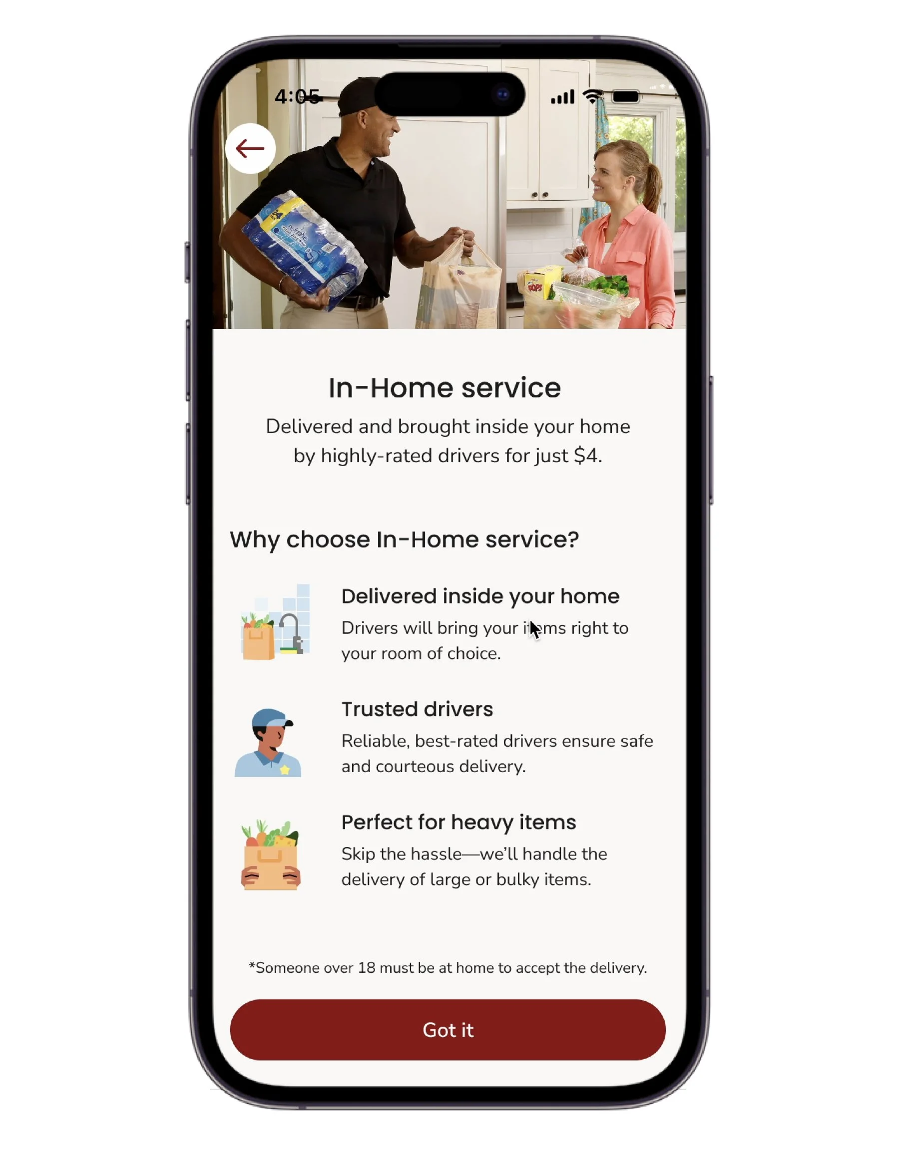
In-Home Introduction
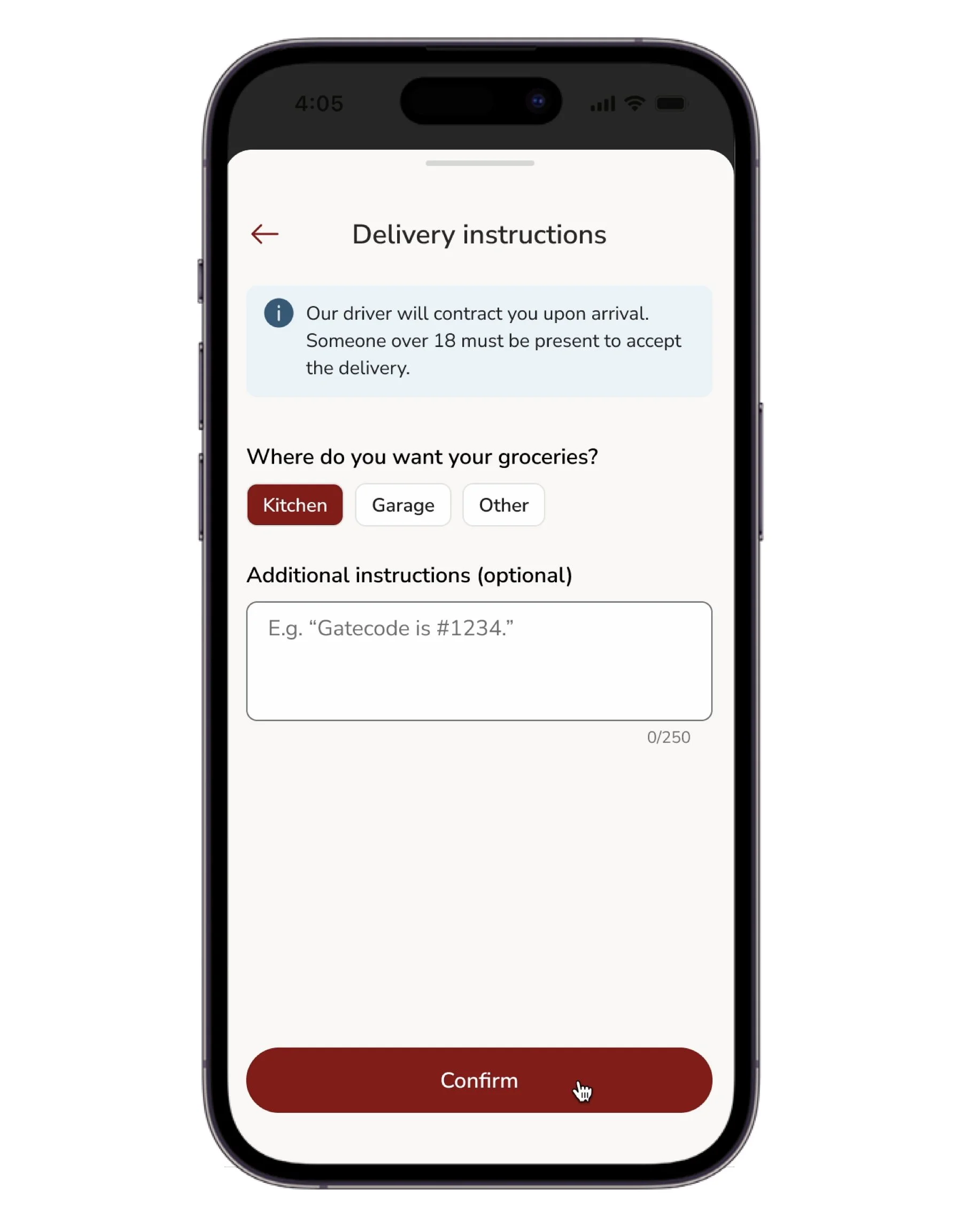
Delivery instruction
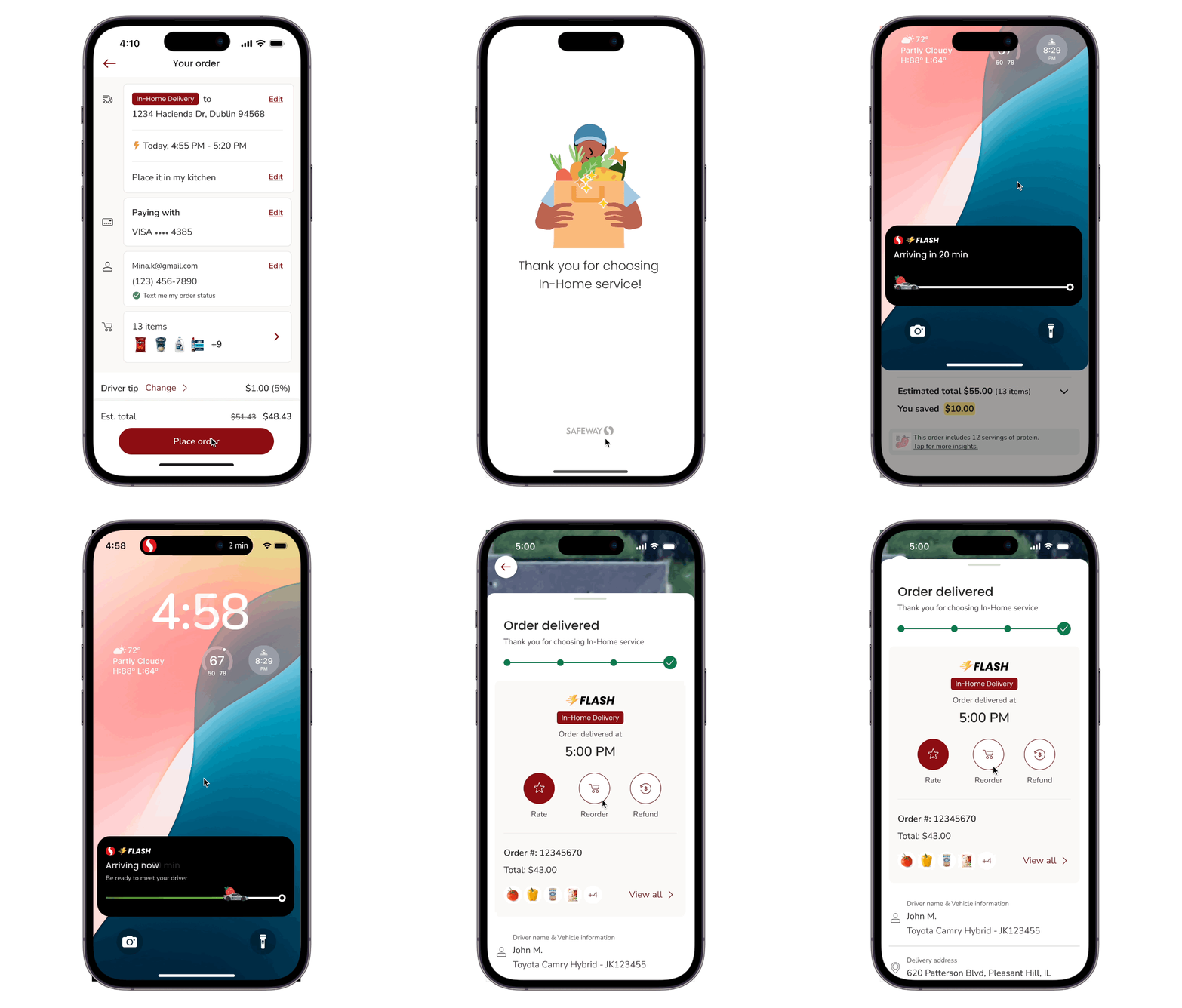
Post Purchase
The journey of exploration
🚩 Challenge 1
How to turn a slot-based service into a global add-on service?
The original In-Home Delivery feature was a slot-based service, requiring customers to select a specific 2-hour delivery window ($9.95) to try the service. However, this limited adoption, as customers couldn’t combine In-Home Delivery with faster or lower-cost delivery options.
To address this, the new design redefined In-Home Delivery as a global add-on service, allowing customers to choose In-Home Delivery with any available delivery slot, regardless of speed or price.
Option 1
Add a global switch to provide In-Home
service option (still called Premium service here)
Option 2 ⭐️
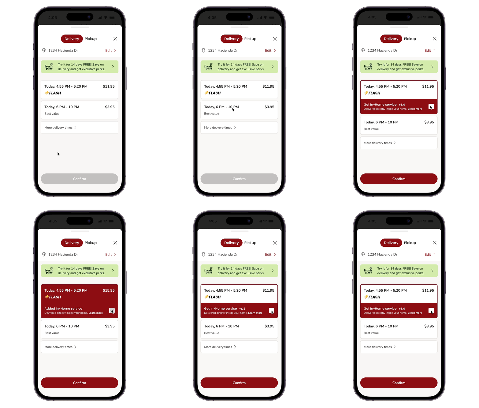
Apply progressive disclosure to show
In-Home service option when customers select a slot.
The Choice - Option 2
We picked option 2 for further exploration because:
Less cognitive load: Users are not overwhelmed by too much information at once and can focus on the slot information first.
Simplify UI: Display the In-Home option only after customers select the slot they want.
Increase efficiency and learnability: Focus on main task (Decide on slot type) without being confused by advanced settings
🚩 Challenge 2
How to communicate the value of In-Home service through visuals, branding and usability?
Customer and internal feedback revealed that the existing design didn’t clearly convey the value of the In-Home service. Although customers were asked to pay an additional $4, many felt they weren’t receiving enough perceived benefit in return.
To address this, I designed a dedicated introduction page highlighting the core value proposition of In-Home Delivery. I also enhanced visual and interactive feedback throughout the experience to make trying the service more reassuring, engaging, and delightful.
Design Principle&Strategy through collaboration with AI
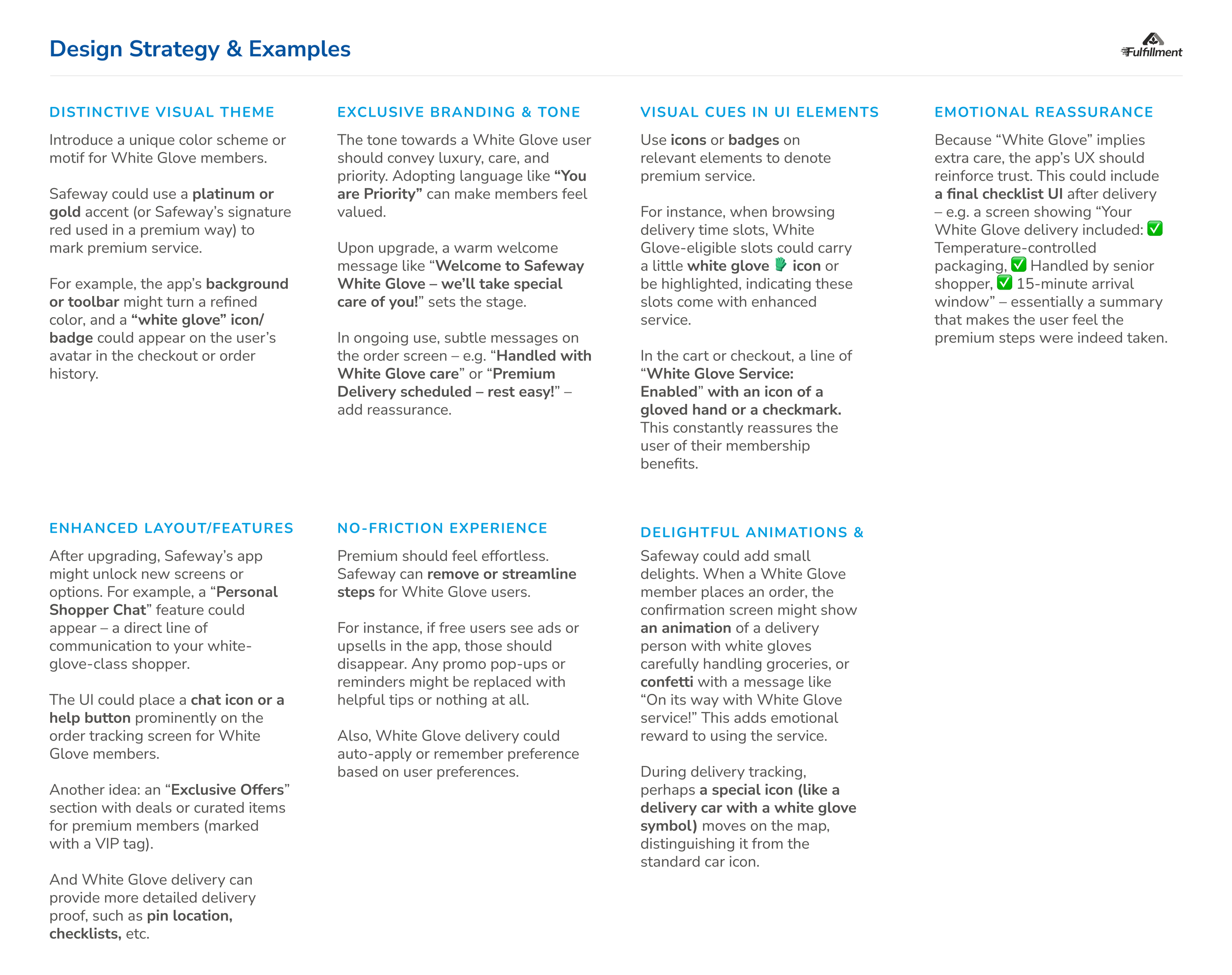
After defining the design goal, I leveraged AI tools to co-create a set of guiding principles and strategies. Through iterative brainstorming with AI, I developed seven design strategies, each paired with practical examples to inform and refine subsequent design iterations.
Iteration 1
Add a premium touch with platinum card-filling interaction. Turn a plain add-on service into an emotional accompany premium service journey.
Iteration 2
Simplify the features and adjust the color.
Iteration 3
Tie the color back to the Albertsons branding system.
The Color Exploration
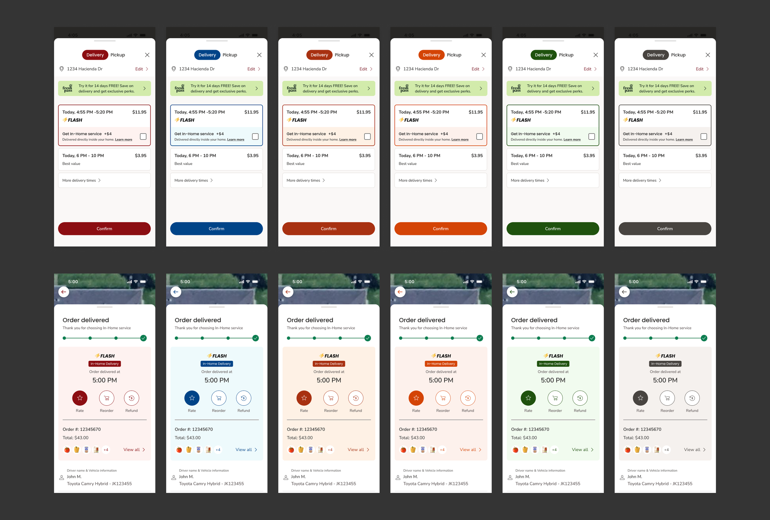
I tried 3 different tones (Dark, Light, Primary) with 6 different Albertsons banner colors (Golden Gate Red, Sutro Blue, Fort Point Brown, Redwood Orange, Presidio Green, and Baker Grey), and chose primary as the main color.
Dark-based Theme Color Exploration
Light-based Theme Color Exploration
Primary-color-based Theme Color Exploration
Primary-color-based Theme Color Exploration on Delivery Instruction Page and Learn More Page

