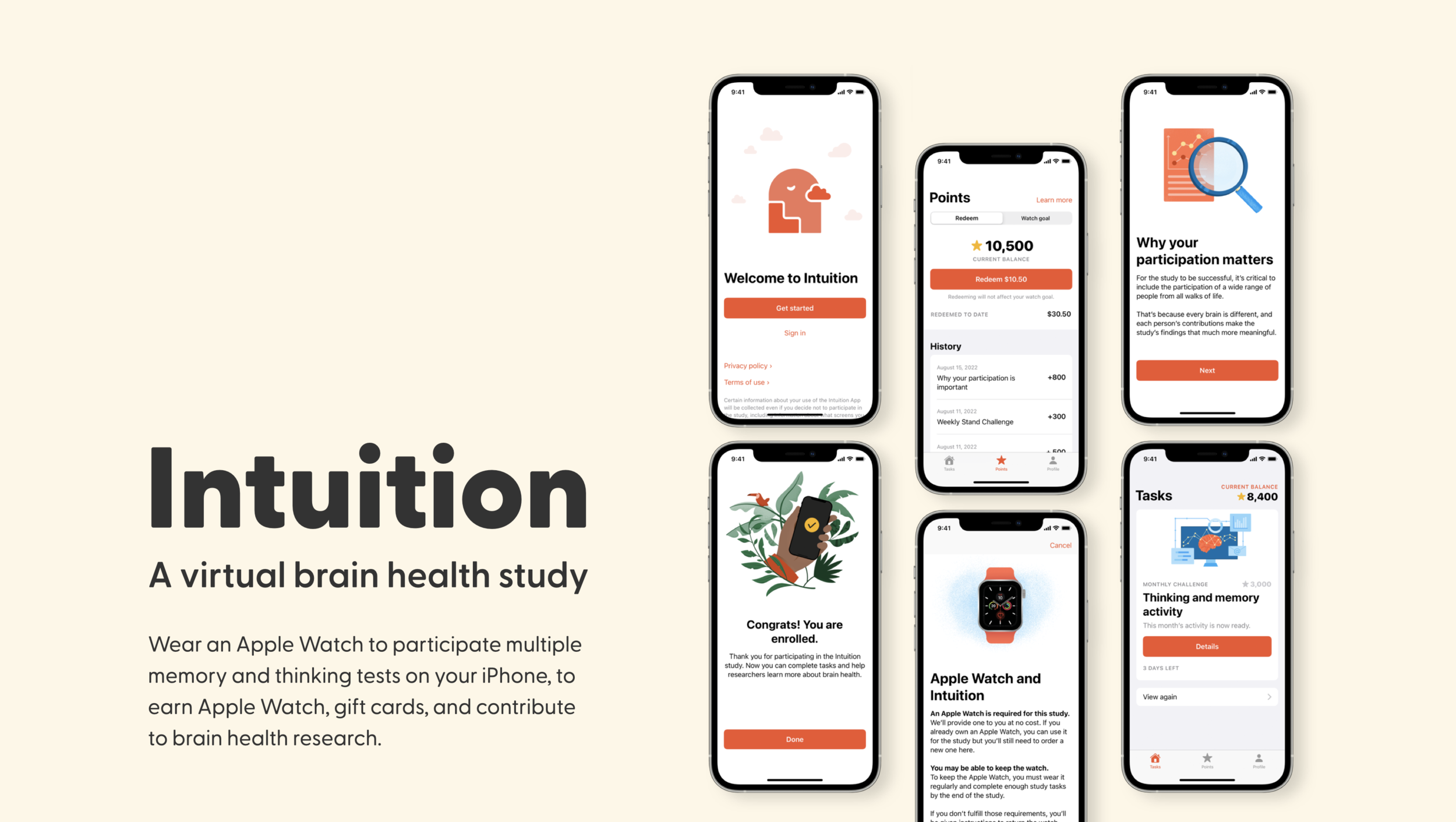
Overview
Intuition is a virtual brain health research study app designed by Apple for Biogen that measures longer-term changes in thinking and memory in adults. By participating the study and completing multiple assessment tests, users can earn an Apple Watch, plus gift cards or charitable donations, as well as help researchers investigate the role digital devices could play in measuring thinking and memory.
I was responsible for redesigning the HFT (High Frequency Testing) feature, the most important test in study, and addressed usability issues in HFT card and final animation of End Review.
Company
Apple
Role
Product Design (UI/UX, Prototyping)
Team
Product Designer, UX Researcher, Content Strategist, Producer
Duration
Aug - Oct 2021
Location
Cupertino, CA
Achievements
Publication in Neurology Journals
Hft FEATURE overview
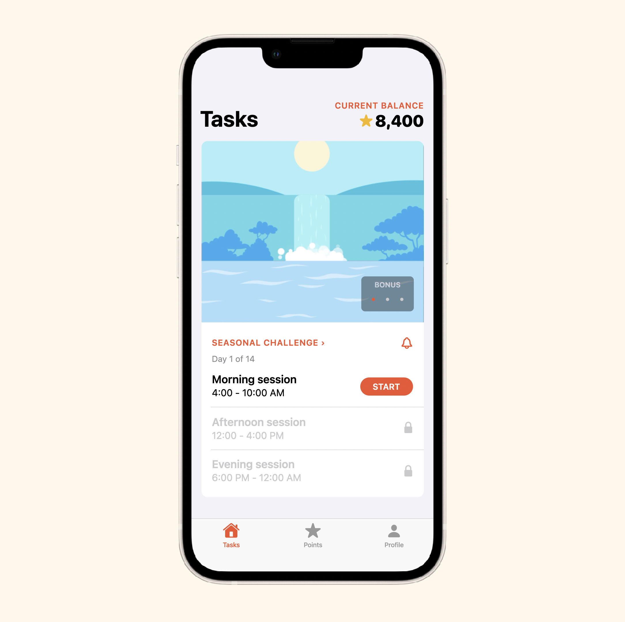
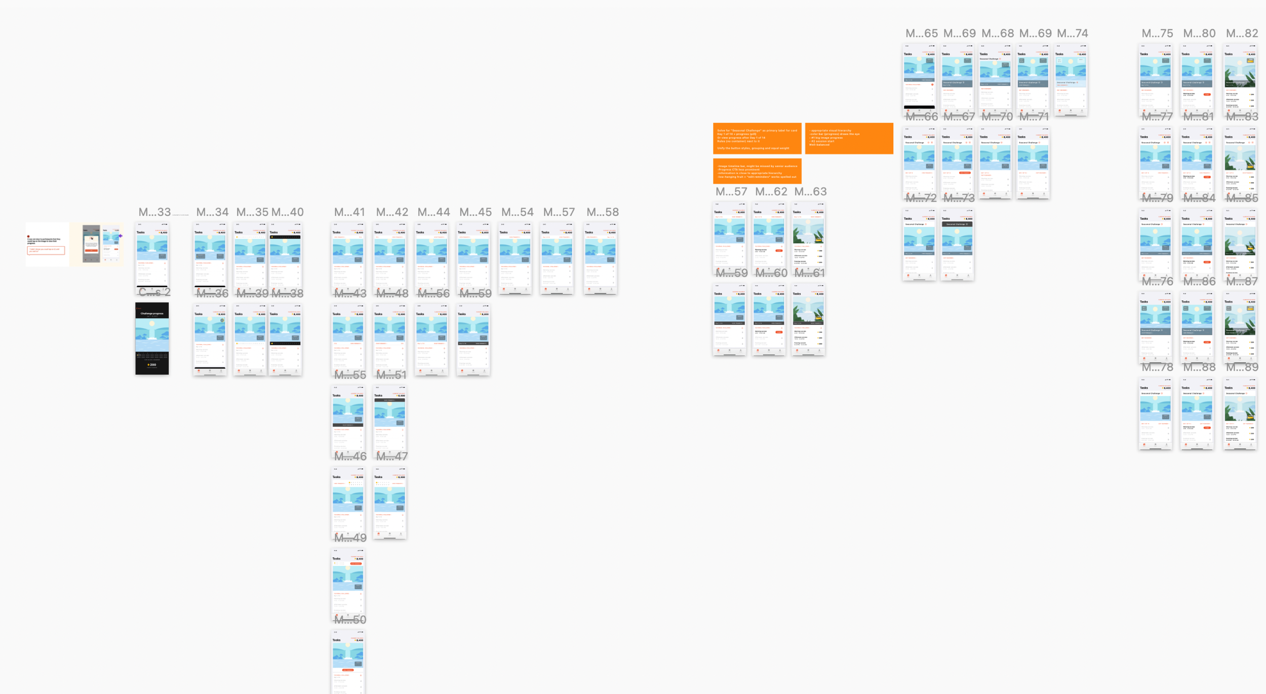
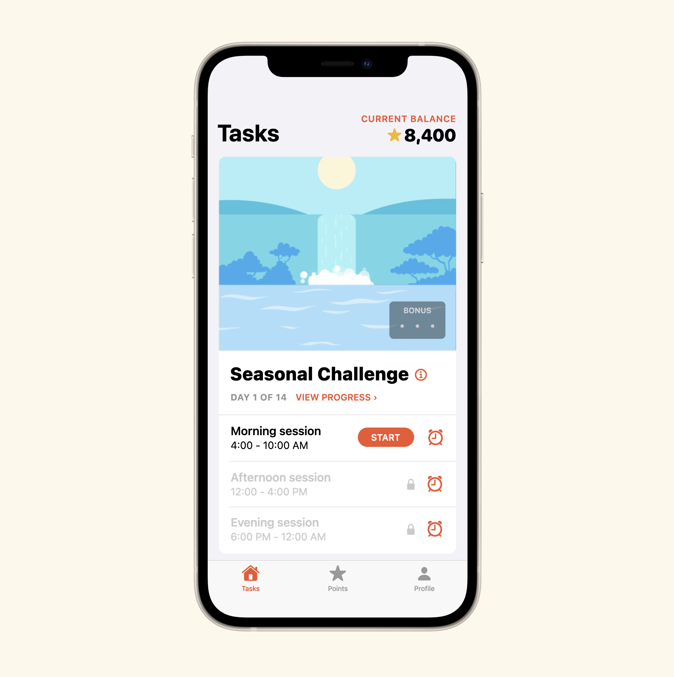
HFT (High Frequency Testing), called Seasonal Challenges in the app, is the most important test in Intuition study that comes in every 3 months and lasts for two weeks. The user could complete 3 sessions each day in the morning, afternoon and evening to earn points. As the user completes more sessions, the image will evolve towards a surprising ending.
problems & design directions
From user testing and interview, we found 3 major usability problems:
Unclear image is tappable:
It was not clear to participants that they could tap on the image to view their progress.
Unclear where to edit reminder:
It was not clear to participants that tapping on the bell was where they would go to edit their reminders.
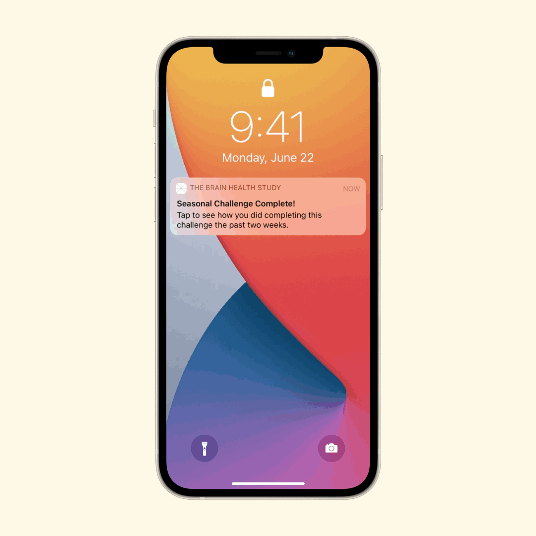
Unclear purpose of final animation:
Participants mostly did not understand what was happening with the animation on the challenge overview, and sometimes initially ignored it.
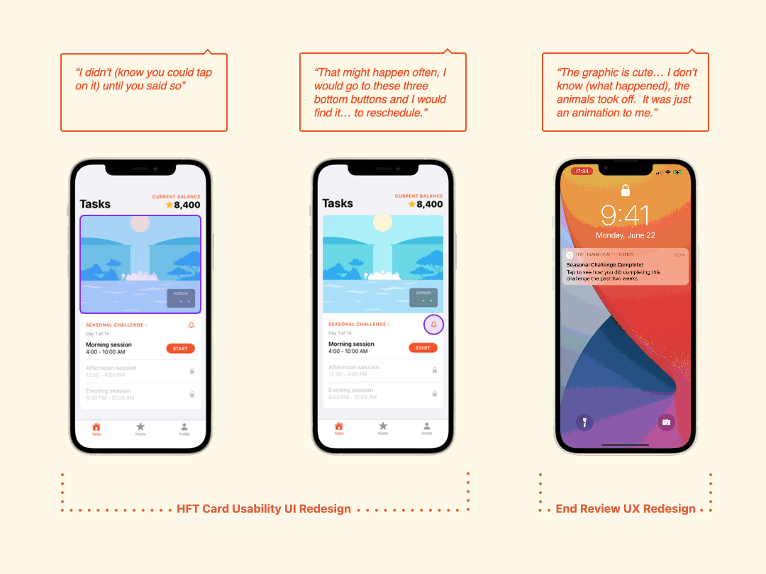
We turned 3 problems spaces into 2 design directions: HFT Card Usability UI Redesign + End Review UX Redesign
what did i explore?
I explored different variants for HFT card and End Review final animation experience to:
For HFT Card Usability UI Redesign:
Reprioritize the hierarchy of HFT card UI to make sure the user is able to review the progress and edit session reminder with ease.
For End Review UX Redesign:
Redesign the experience of final animation to make sure the user understand the purpose while not changing the whole structure.
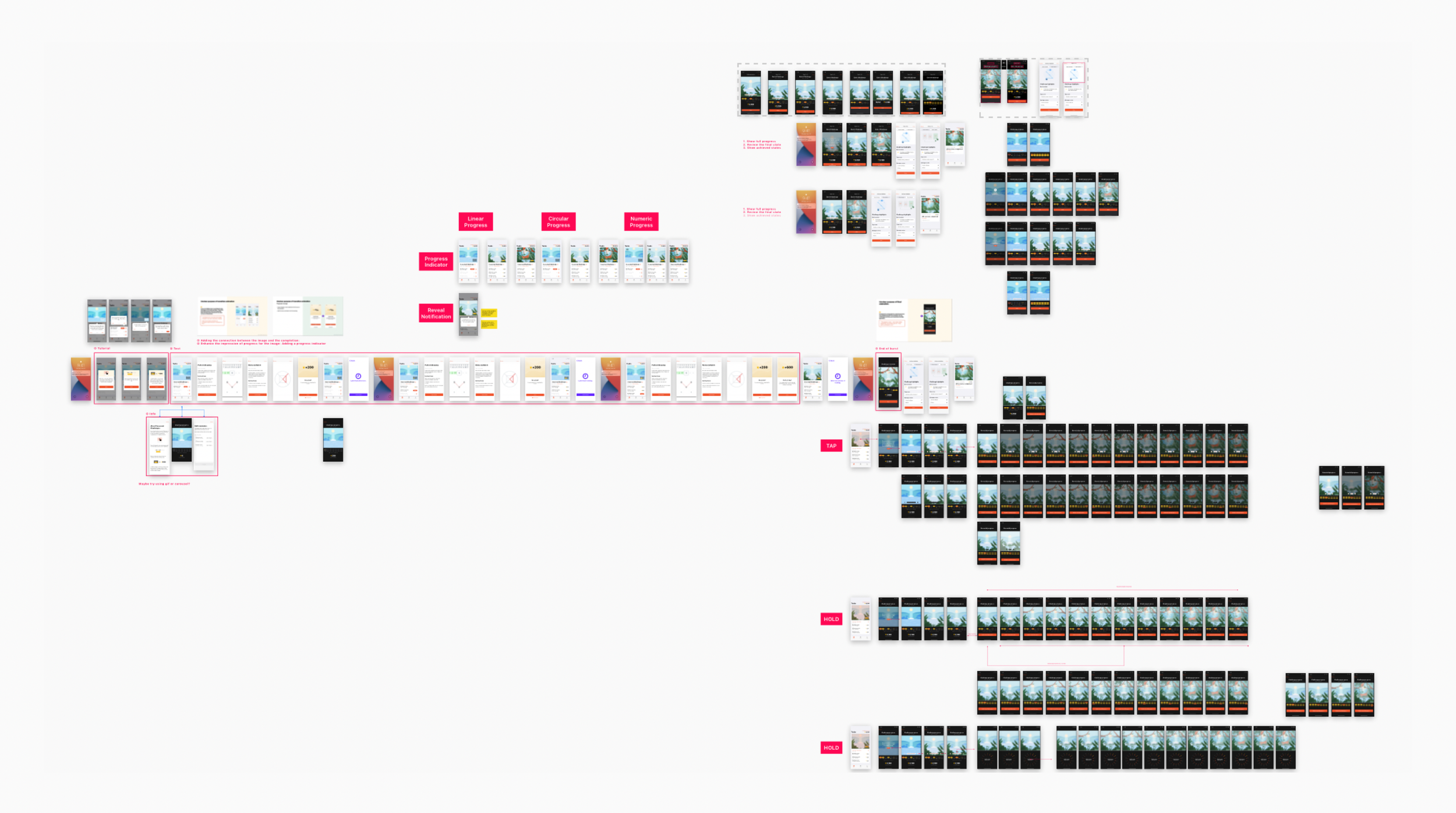
Insights:
Reminder should be more intuitive and mapped to each session
Image cannot be blocked by too much information
Call-to-action of viewing progress should be more clear
Insights:
Empower users the sense of control
Simplify the End Review experience and prioritize the states
Enhance the connection between animation and progress
Final Solution
With the new hierarchy, the user would be able to easily find the progress and reminder.
For the End Review animation, the user would get to know the concept from the tutorial carousel and “hold to review” button.