

GrowSquares
Overview
I spent my 2020 spring as a UX & Product Design Intern at GrowSquares, a startup that helps people grow smart, personalized outdoor urban gardens with ease.
Challenges
Based on the previous testing, there are mainly three problems of the products:
1.Users need to pay without understanding what they are buying
2.Plant Selection section didn’t convey clearly the idea of GrowScore and dynamic environmental data
3.Users were very confused about how to use the mobile app
Objectives
Design an efficient and intuitive flow that allows users understand what they are paying for and seamlessly use the service.
Company
GrowSquares
Role
Product Design (Wireframing, High-fidelity Interface, Prototyping, Initiate Design System)
Team
Product Designer(Me), Production Designer, CEO, data Scientist, Product manager
Duration
Jan 2020 - May 2020
Location
New York, US
As a product designer working in a startup company, one of my responsibilities I have to consider is how design can impact business and help the revenue grow. I collaborate closely with product managers and engineers to develop solutions that work for both business stakeholders and users.
CUrrent User Journey
I transformed information architecture and user flow to current user journey to digest problems.

ProblemS
Based on previous testing and my analysis, there are main three problems.

Here are three cases of how I use redesign to solve the problems through balancing the needs of business and users:
Case 1
Increase Conversion Rate by Redesigning the Payment Process
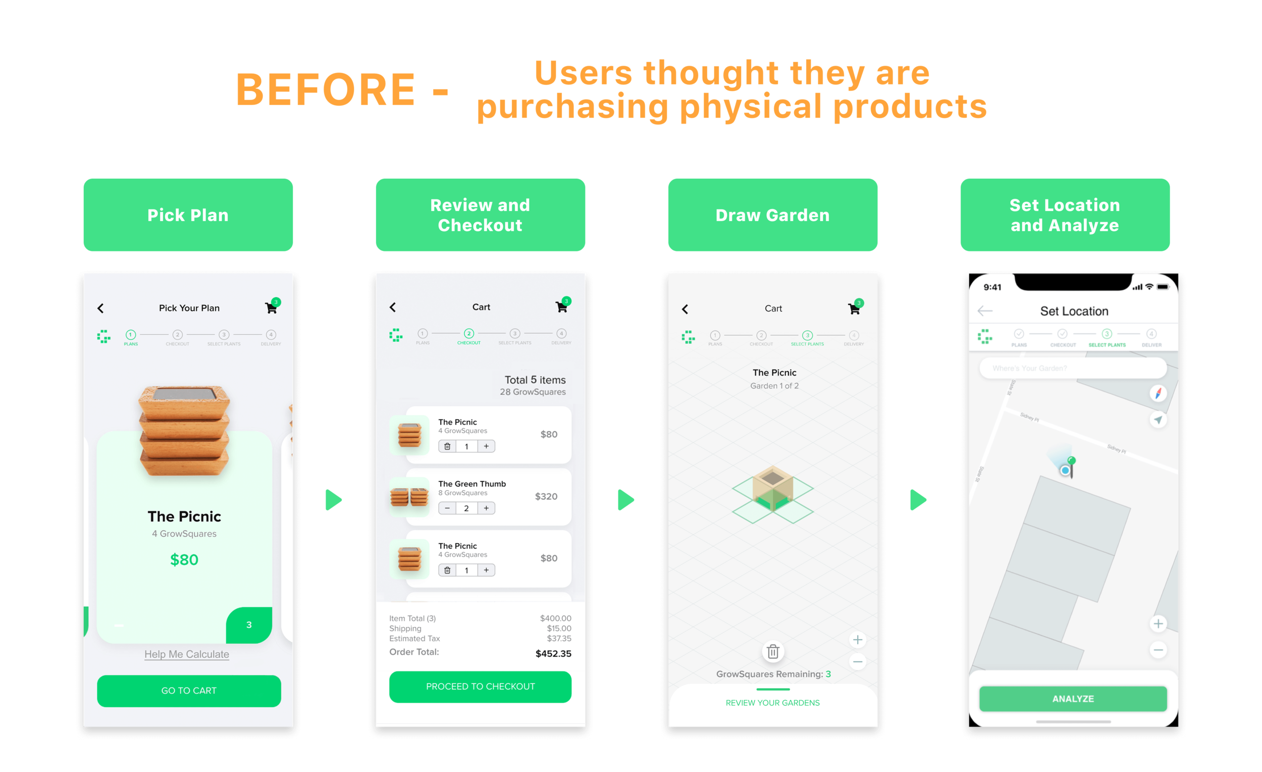
PROBLEM
Users need to pay in the “PICK PLAN“ section, but at the same time they are confused about what they are purchasing. As the previous design was to let them create a virtual garden in the app and pay to get the physical product afterwards, but creating the virtual garden leads them to a misunderstanding of buying physical products because they see the picture of rendering Growsquares. They don’t know they need to pay for the consulting service based on space.
Challenge: technical constraints:
Due to the unavoidable cost of using third-party API to analyze on-site environmental data, users need to pay before they analyze their location before they receive the actual product.

Solution
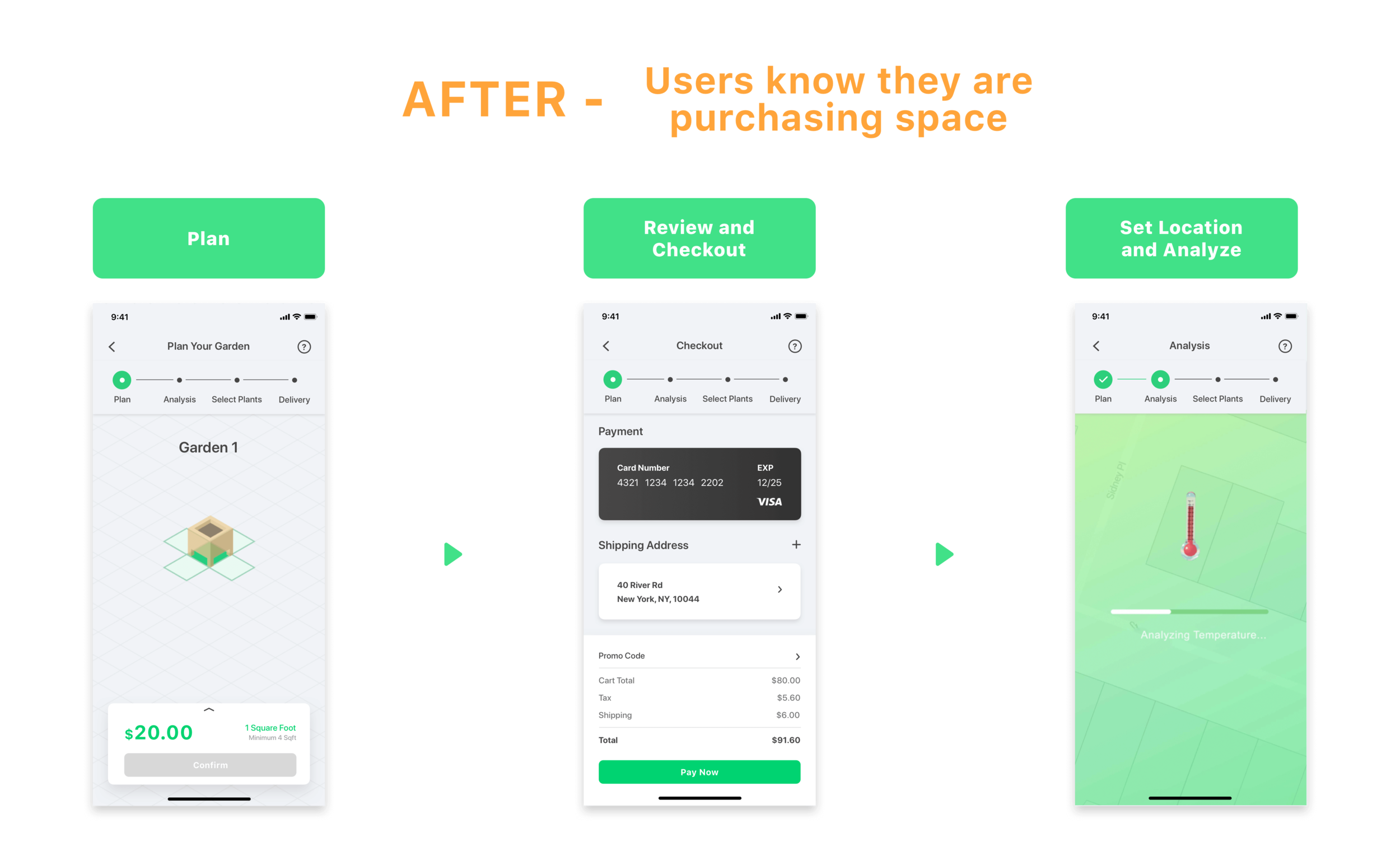
To reduce the friction when users decide to pay for the service fee and feel more confident in completing the payment process, I modified the current user journey and flows and to give users a clear heads-up of what they will pay for. Also, by giving them an overview on the main page to educate users that they would have to pay to activate their virtual garden.
Purchasing through
Drawing Virtual Garden
Combine the step of “PICKUP PLAN” and “DRAW GARDEN” together to better convey the message that users are paying for their space instead of physical plants.
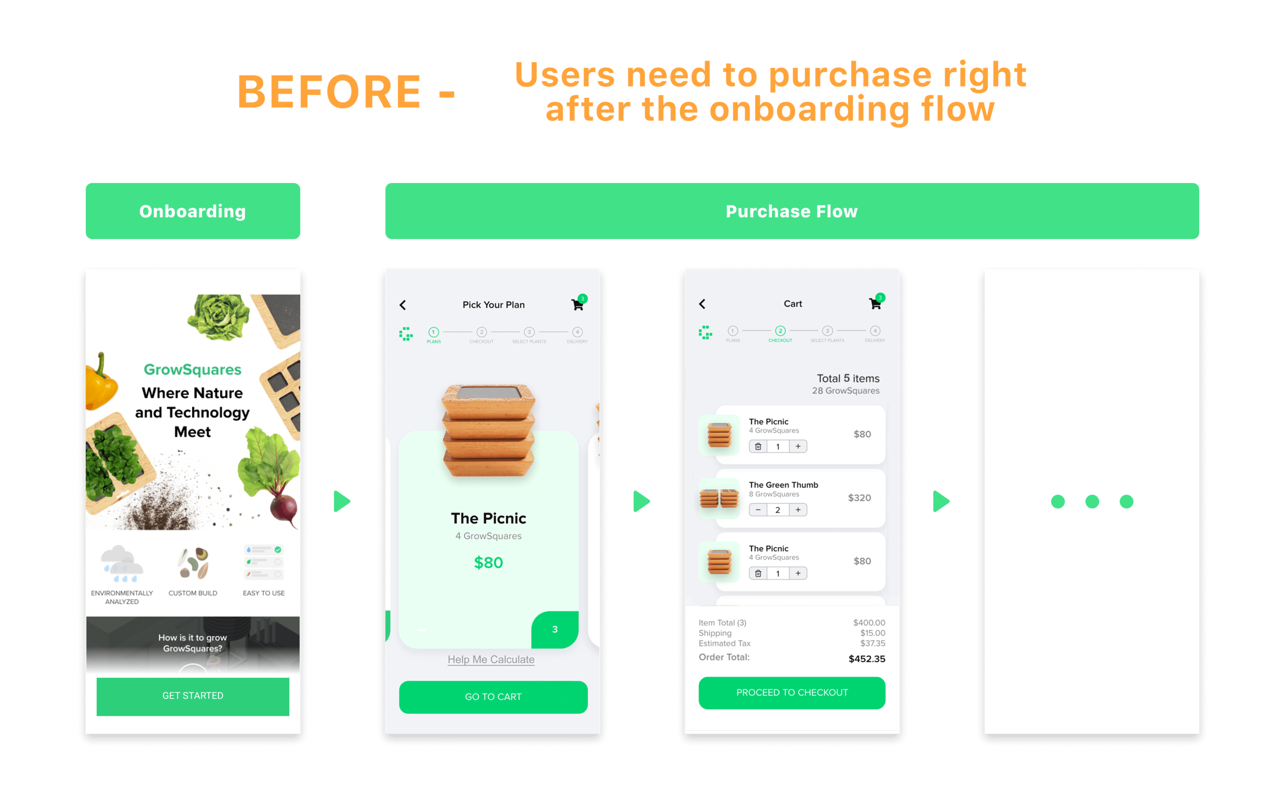
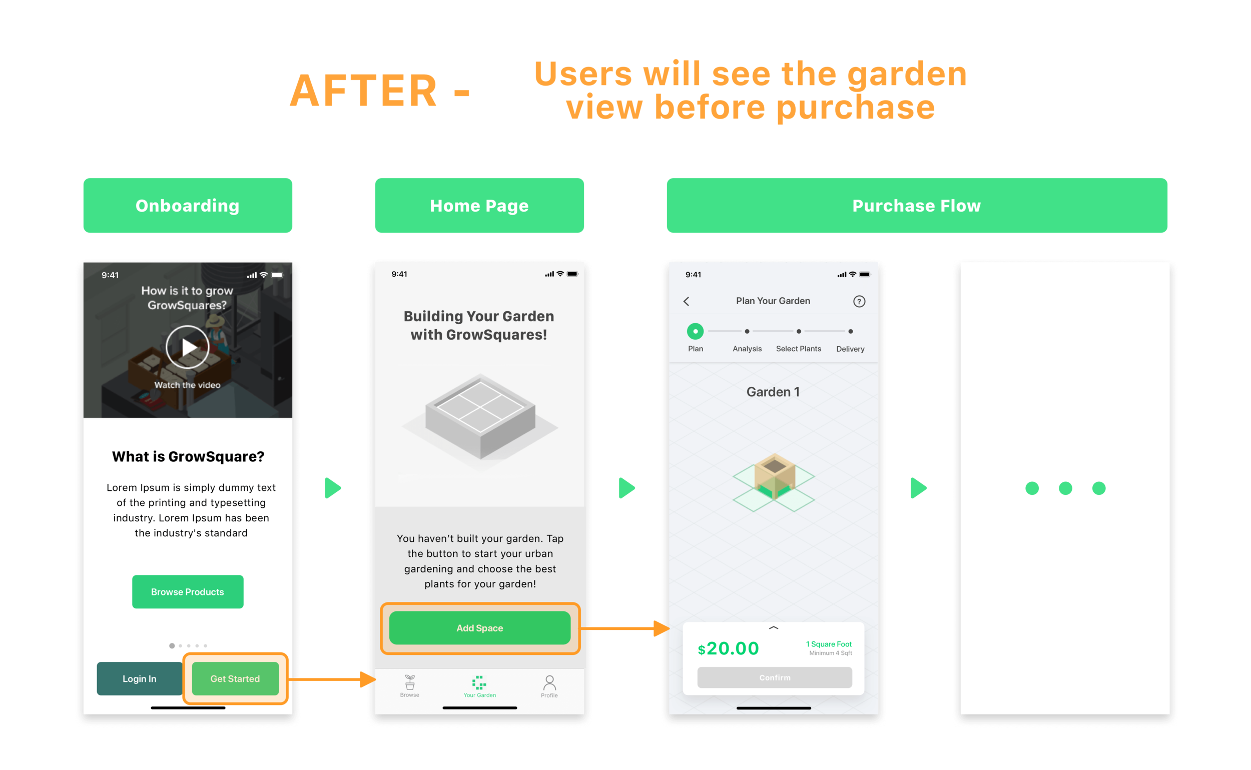
Give a Hint before Buy
Let users see the inactivated garden at home page before purchasing the service, so that they are aware of what they will purchase in advance.
Case 2
Visualize data to help users understand the products and make better decisions
PROBLEM
1.Users didn’t see the relationship between classification and GrowScore, a score that quantifies how well a plant variety will grow at a location at a certain time, as the previous plant selection section didn’t connect them together.
2.Previous design didn’t allow users to see the different classification of plant varieties based on different planting date.
3.Users didn’t see the relationship between planting date and environmental data, which should be dynamically related to each other, as the previous design separates them from each other.
SOLUTION
Previously, the overall user journey has a lot of unnecessary steps but users are still confused about how to use this app because the onboarding part only conveys the values of the brand but not how the product works.
Take in Everything
in a Glance
Since the MVP only includes 12 plant varieties, this design of classification enables users see how many plant varieties under each plant type and how well they will grow (via color-coded dots and classes) in just one interface.

A Dynamic Dashboard
Let users see how GrowScore and environmental data change based on different planting dates. Color-coded markers reinforce the relationship between classification and GrowScore.

Case 3
Redesign onboarding experience to reduce the dropout rate
PROBLEM
Users are not familiar with our service and found very confused while using our app. One reason is that onboarding part only conveys the values of the brand but not how the product works, the other is that the overall userflow are not intuitive and has a lot of unnecessary steps.

Solution
I started by looking into the previous user flow and restructured the information architecture to avoid unnecessary steps. Then I tweaked the UI and interaction to improve the overall usability and worked with product managers on content strategy of onboarding page to convey both how the product works and branding messages.
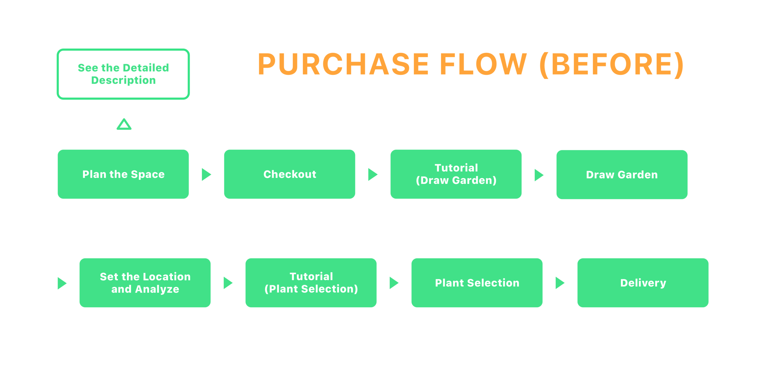
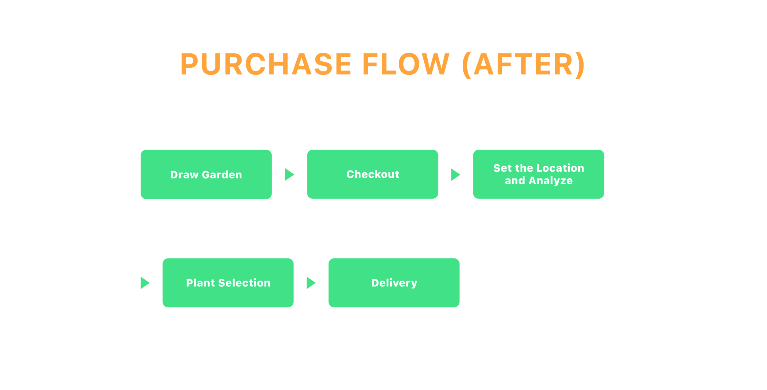
Restructure Purchase Flow
Simplify the previous purchase flow from 9 steps to 5 steps, and cut off unnecessary steps, to let users finish purchase with confidence as soon as possible.
TRY THE PROTOTYPE by YOURSELF
Click the top right corner to access fullscreen mode.