

Libra
Overview
Libra is a revolutionary political news platform which aims to solve political polarization by helping political news readers know where they are in the spectrum and read news from different perspectives.
It aggregates different news from different media and maps them into media bias chart. With the help of machine learning algorithm, readers are able to know how biased each article is and which sentences causes the bias. It also allows users to see their reading history and political tendency.
Award:
Finalist for 2020 Interaction Awards
Role:
Research, UI/UX Design, User Testing
Team:
Chi-Ching Tsai, Agnes Yoon, Cheonhyun Park, Yohe
Tools:
Sketch, Principle, Premiere, After Effects
Key feature video

Political Polarization
Data shows political polarization has been intensified since the last two decades. Republicans and Democrats are more divided along ideological lines – and partisan antipathy is deeper and more extensive. And ideological thinking is now much more closely aligned with partisanship than in the past. As a result, ideological overlap between the two parties has diminished.

Solution
A news platform that presents news from different political perspective and diagnoses where does the bias come from

media bias map
Navigate news by perspectives
Users can pick the daily topics and see how the articles are distributed in media bias map, so they can choose to read articles from different perspectives.
The map was designed based on the data from Media Bias Chart. The X-axis represents for the political ideology and the Y-axis represents for the factuality of the content

bias diagnosis
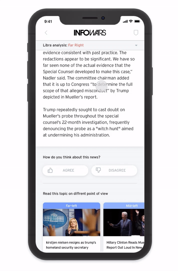
Notice political bias behind news
With the help of machine learning algorithm, users could see how biased each article is and which sentences cause bias.
The AI algorithm could detect the conspiracy level, pseudo level and sentiment level of the article, and highlight the sentences that cause the bias with the corresponding color.
multi-perspective
Vote for opinions, Hear other voice
Users can vote to express their opinions about the news, and their political ideology could be reflected on the profile page.
In order to keep a balanced viewpoint, users could see articles with different perspective under the same topic.
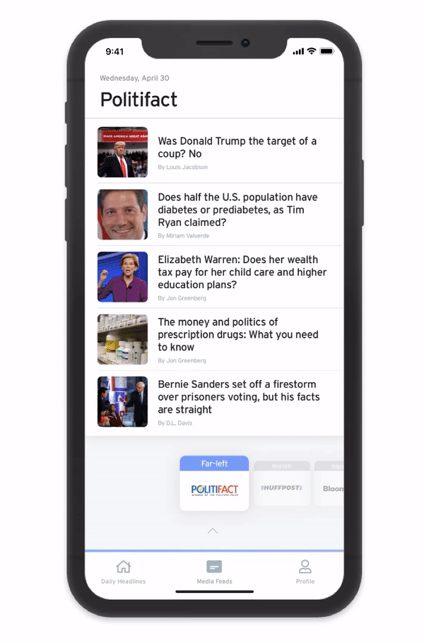
media feeds
Read articles from different media
In order to see the the political ideology of different media, users could swipe to switch different media, and see where the media are located in the political spectrum.

personal report
Diagnose your political behaviors
Users can review their political ideology, what kind of news they have read, how they vote for different articles, and what kind of topics they are interested in, based on their behaviors.
How we get there?
A crisis of trust in journalism
People are questioning about the credibility of news media platforms
To find out more in-depth insight, we interviewed various newsreaders with political backgrounds. They think media outlets are not trustworthy but they cannot find other way to gain information and use them to assert their opinion based on news media that they read or watch.

DESIGN Sprint 1
With the initial needs from users and the research findings from online resources. We started to quickly design and test with our initial concept.
Initial Draft

Wireframing Flow

Version 1

Key-findings in User Testing

DESIGN Sprint 2
The goal of second design sprint is to:
1. Find a believable source of data to convince readers of the political ideology of each news
2. Design a better way to show the landscape of news articles in different political ideology
Therefore, we used Media Bias Chart as the data source of the political ideology of each news
Key-finding: Media Bias Chart
Media bias chart maps different main media into the coordinate system. The X-axis shows the ideology of media and the Y-axis stands for how accurate the articles from each media are and if they are based on original fact or not.
Based on the data from the chart, our product is able to map different media and articles with their political ideology and factuality.

According to user feedbacks and research findings, we designed a map view in our main page and also provided media page to show the political ideology of each media.
Initial Draft

Wireframing Flow

Variants of Media Page
We tried to design different ways of showing multiple headlines in the map page and figured out showing all the headlines together will be very messy.

Variants of Main Page
We also tried different ways to design media page and found switching between different media is a good way to review different media and their articles in the media page.

Version 2

Key-findings in User Testing

Final Design
The goals of final design is to:
1. Design a more clear and user-friendly map view
2. Figure out a way to show where does the bias come from
3. Design a more clear way to show the ideology of each media
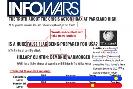
Therefore, we used bias-checking machine learning algorithm to detect the sentence and the words that cause the bias of the article
Key-finding: Bias-checking Machine Learning Algorithm
Researchers from MIT’s Computer Science and Artificial Intelligence Lab (CSAIL) and the Qatar Computing Research Institute (QCRI) have demonstrated a new system that uses machine learning to determine if a source is accurate or politically biased with 95% accuracy.
With the help of machine learning algorithm, our product is able to analyze the articles and capture the sentences that cause the bias, to let users be aware of the bias of the article.
According to user feedbacks and research findings, we integrated machine learning system into our article view and also designed a more user-friendly map view and a more clear profile page. We also added a mini spectrum in our media page.
Wireframing Flow

Final Screens
Variants of Map Page
We tried different UI with map view and discussed on which one is more clear for showing the articles and helps users better understand the feature.


IMPACT
We are so thrilled that Libra is one of the finalists for 2020 Interaction Awards honored by IxDA!
With Dan Makoski, the Jury Chair of Interaction Awards 2020